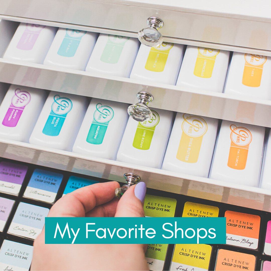
I was planning to write this post since forever, when I had an opportunity to try the Catherine Pooler Ink Pads according to the Winter Trio Hop which was a really great hop between three amazing brands, but I wanted to test them longer.

I am not going to lie, I never understood the hype around these ink pads, but when I received them in November, I fell in love with them, and I needed to order some colors immediately! I can tell you, I was the happiest girl ever when they sent me the new Date Night Ink Pad Collection! Why? Read the details below.

THIS POST FEATURES
• For the additional supplies visit the thumbnails below this post or click here for the visual supply list.

Do you enjoy this post? I really appreciate if you pin this photo to your Pinterest.
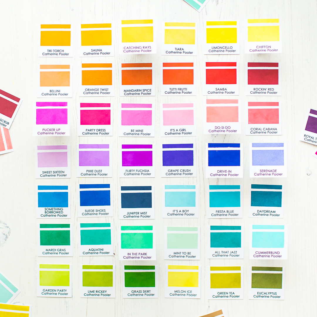
When I received the new Date Night Ink Pad Collection, I thought it’s a perfect time to swatch them, and write a post about them. You need to know, I am writing this post, because I am really obsessed with Catherine Pooler Ink Pads. I received the Date Night Ink Pad Collection as a gift, but no one asked me to create this post.

Now Catherine Pooler INKS have their FREE own swatch printable, what I will use in the future too because it's very cute and useful (you can find it here). But when I created this post, for the swatching I have used the editable ink swatch template from Jennifer McGuire, edited with the names of inkpads then printed out to heavy weight cardstock. In the end I swatched my inkpads with the Color Swatches for Ink Pads Stamp set. Now let’s jump to the mentioned tips.

PERFECT FOR STAMPING
Okay, everybody knows that, the inkpads are for stamping, so why I am wasting your time here with this tip? Of course, the inkpads are for stamping, but I want to mention, that these inkpads have really high quality, smooth foam pads and they are super juicy.

You barely have to touch the inkpads with your stamps which means, one or maximally two taps with Catherine Pooler Ink Pads are enough to cover your image perfectly and you are ready to stamp. It transfers perfectly and the result is a beautifully smooth finish.

You don’t need to repeat the stamping process for the same image, because the stamping result will be solid and smooth from one stamping which is priceless and time saving as well.

I am in love with the beautiful Cummerbund color I have used on this card. For me this is the perfect light turquoise color, and I can’t get enough of it! For more details of this card visit my Instagram post here.

USE THEM AS WATERCOLORS
The Catherine Pooler Ink Pads are a perfect choice for your favorite water coloring techniques like various watercolor washes as well as wet-on-wet or wet-on-dry techniques. I am planning to order in the future their re-inkers and use them as watercolors too.

I have created this simple and easy card with the new Date Night Ink Pad Collection where I have used them as watercolors. In the background you can see watercolor stripes from three shades only.

I have used Cummerbund, Pucker Up and Chiffon colors. I painted with Cummerbund first and after a quick heat set continued with the other colors too.

I just overlapped the colors and the result is this bright rainbow striped background.

THEY ARE GOOD FOR STAMP LAYERING
If you check the full inkpad collection, you will notice that, the colors are coordinated perfectly. You will find many inkpads in matching tones and saturations. After the stamping you will need to wait a few seconds until it dries. The totally dried image will be as light as the lid, but I will talk about this later in this post.

IT’S A COLORFUL WATERMAKR INK
If you have clear embossing powder in your stash, then I suggest you to try your Catherine Pooler Ink Pads as a colorful watermark ink.

These inkpads do not dry immediately, so you will have a few seconds to add embossing powder to the top of it. Then just continue your heat embossing process. It’s so cool especially for the sentiments! 💙

YOU CAN USE THEM FOR INKBLENDING
When the background was dry on my previous card, I made an ink blending with the Catching Rays Ink Pad behind the sentiment, to pop it out more.

So YASSS! The Catherine Pooler Ink Pads are perfect for smooth ink blending too and it looks really nice, when you are combining two techniques on one card.

OTHER FANCY TECHNIQUES
Beside the above-mentioned techniques, you can use these inkpads for many trendy cardmaking techniques like the Stamp Kissing, Ink splattering, distressing with water and many more. You can mix the colors with white watercolor to make it more pastel for water coloring, or mix it with white gouache to have opaque colorful splatter in any color.

This is another example above. Here I have created the background with Flirty Fuchsia and Aquatini from the Life of The Party Mini Set. (For the houses I have used the same set.) Then splattered with various watercolor mixes. The result is a bright and smooth blend with cool splatters. Read more about this winter card here.
THERE ARE NO MORE COLOR TRANSFER PROBLEMS
The stampers biggest nightmare is to stamp after a vibrant dark color a lighter one to get the wanted light shade. Or drop the acrylic block to the finished stamping LOL Unfortunately the Catherine Pooler Ink Pads will not levitate your stamping blocks, but you can feel totally safe, stamping a lighter color after a vibrant ink color.

Just make sure to clean your stamp before the next color. I am cleaning mine with stamp shammy, then I am stamping a few times on a scratch paper before inking it again.
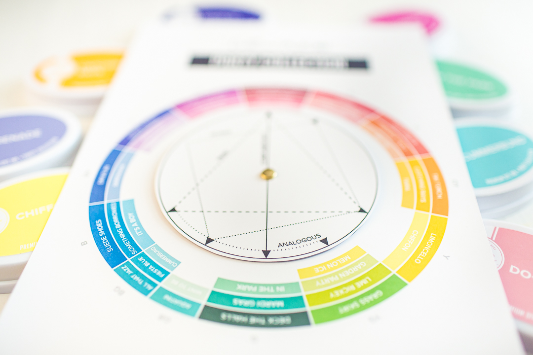
FREE COLOR WHEEL
I was super excited when I saw, that they created a new Color Wheel for their inkpads, which you can download FOR FREE! Version 1 | Updated version 2 with the new ink colors.
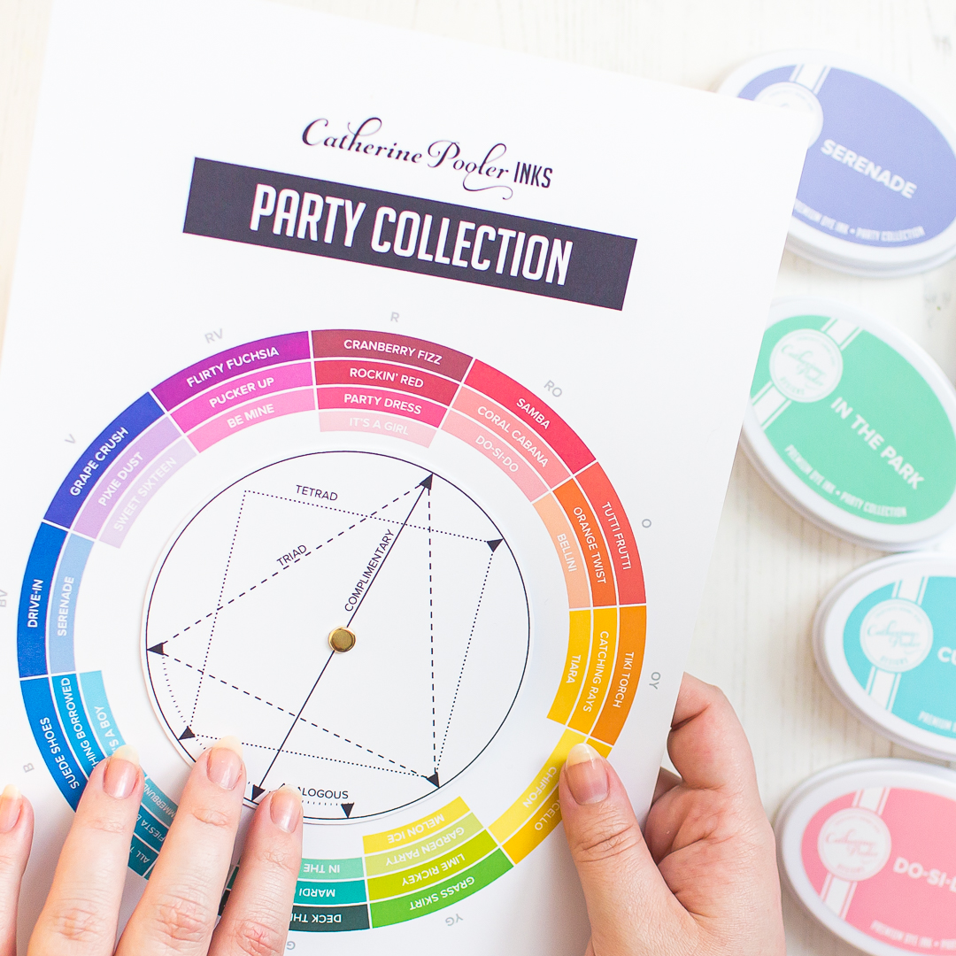
I always wanted to have a color wheel and now I have more, because it totally coordinates with the inkpads I love, and I don’t need to think about what colors to choose. Be sure to follow their blogpost to learn how useful it is for creating your own color combos. And they have a color theory to the post with video tutorial too.
IT HAS WIDE RANGE OF COLORS
They separate their inkpads in two categories, by the colors. In the Party Collection you will find fully saturated colors, which means they are happy, bright and vibrant colors. In the shop you can see them in rainbow order which is really inspirational.

In the Spa Collection you will find low saturated, soothing colors, kind of muted and greyed down colors which are really trendy now and, on the cards, they just look amazing.
INNOVATIVE DESIGN
Last but not the least, let me talk about their inkpad design. First of all, I really love that they are white, and on the top of the lids you can see the inkpad color. In 2021 Catherine Pooler Designs Updated their Ink Pad Labels. They did this because they wanted to have a more accurate representation of their ink colors.
This means, that the top of the inkpad, will match with your stamped image once it has dried. Soo fantastic right? They made it available for their existing customers for an affordable price, if they want to fresh up their already owned inkpad lids. If you don’t own Catherine Pooler Ink Pads yet, then you will receive automatically the upgraded inkpad lid.
VIDEO TUTORIAL
** Update 1/9/22: I have swatched all my Catherine Pooler Inkpads with some really useful stuff what they released in a video tutorial. Watch the video here or below.
Thank you so much for joining me today, I hope you found this post useful. I really like the Catherine Pooler Ink Pads, they are amazing! Please let me know in your comment what are you thinking about this brand. If you want to read more about their ink pads, feel free to check their All About Inks post. See you next time, Mona.
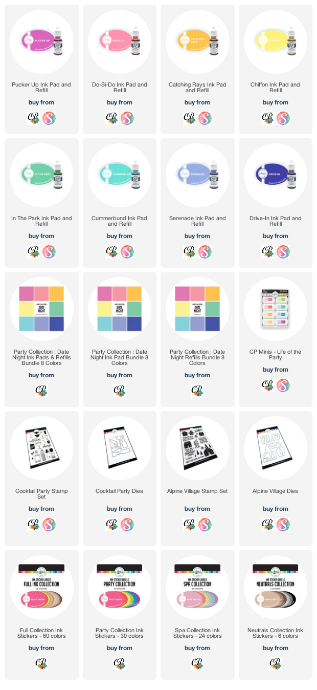
USED SUPPLIES
Using affiliate links does not mean additional costs for you. I really appreciate your support. I am using only products I LOVE. If you buy supplies through my affiliate links, you support my channel and blog with a small commission and when you shop through my links, I will do a happy dance. Affiliate Disclaimer.