This video is also part of the YouTube Hop + Giveaway, with some fun prizes to win!
You can watch the full cardmaking tutorial above and find the supplies linked throughout the post.
For these handmade cards, I’m combining the Peony Corners Bundle with ink blending, layered die cuts, and dimensional details. And as you’ll see in the video, one little ink blending mistake actually changes the direction of the card.
With larger stamps like this, I usually stamp the image at least twice to get a nice, crisp impression. I also give the ink a quick heat-set before moving on to the stenciling.
Better craft photos are easier than you think. Start with 5 simple tips you can try today. 🎁Get myfree photo ebook here!
INK BELNDING THE FLOWERS
For the orange flowers, I stared with Catching Rays Catherine Pooler Ink, followed by the slightly darker Tiki Torch. For the final shade, I bring in Coral Cabana. Although all three colors belong to a similar palette, Coral Cabana is cooler compared with the first two warmer orange shades.
Using both warm and cool versions of a color creates a subtle contrast that helps the analogous color combination pop.
For the blue flowers, I use Cummerbund as the warmer shade and Serenade as the cooler shade. This is also where things don’t quite go according to plan. I accidentally blend some orange into the blue and use a brush that is too large for the area.
Instead of starting over, I keep working with it, and I actually end up liking the finished flowers even more than my original idea. I corrected my mistake with Ohuhu Nahuku Acrylic Markers. Watch the video above how I did it.
ADDING COLOR TO THE LEAVES
For the leaves, I keep the palette warm without adding the cooler color contrast. I blend Lemongrass as the lighter shade and Green Tea as the darker shade. At the end, I return to Catching Rays to touch up the flower centers before die-cutting the finished floral images.
CREATING THE DIE-CUT BACKGROUND
For the background, I die-cut a frame using the Whimsical Scalloped Frames. I take the white cardstock left over from the center and run it through my die-cut machine again using the Charming Flora Cover Die. I also create one full die-cut with the same cover die. These pieces create the layered white background behind the colorful florals.
The scalloped frame is attached to the card front with foam adhesive, followed by the floral die cuts with smaller foam squares. Finally, I add a few clear sequins.
Pin this post to your Pinterest board and save this card idea for later.
PHOTO TIP FOR CARDMAKERS
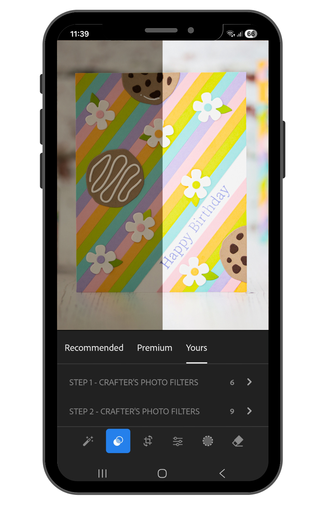
One little reminder for fellow cardmakers who photograph their projects: my photos don’t look finished straight out of the camera either. Let me show you what I mean. This is what they look like when I’m done with the photoshoot, before editing:
I edit these images, just like my other cardmaking photos, using my editing shortcut, Crafter’s Photo Filters. They’re made especially for us cardmakers to help our card photos pop quickly and save time on editing. For more information, visit the Crafter’s Photo Filters page.

BEFORE YOU GO...
Let’s stay crafty friends! You can find more cardmaking inspiration, behind-the-scenes peeks and photography tips for crafters on my Instagram and Facebook pages.
📸✨ I’m on a mission to help cardmakers and crafters feel more confident with photography, so their beautiful creations can shine online too.
I’ve listed all the supplies I used below, so you can easily find them. Some of the links are affiliate links, which means I may earn a small commission if you make a purchase, at no extra cost to you. Thank you so much for supporting my blog and creative work!
For the coloring I used the coordinating Peony Corners Stencil Set. I started with the flower centers using Squeezed Lemonade and added a little Fossilized Amber Distress Oxide Ink here and there. Then I blended Kitsch Flamingo around the petals, going slightly over the yellow areas too. This little overlap created that pretty peachy color which I really love.
Pin this post to your Pinterest board and save this card idea for later.
Next I moved on to the leaves and flower centers with the other stencil. For these areas I used Black Soot, Hickory Smoke and Old Paper Distress Oxide Inks, then finished the flower centers with Black Soot as well.
STAMPING AND DIE CUTTING
Once all the ink blending was finished, I placed the cardstock back into my MISTI. I had kept the stamp in exactly the same position, so I could stamp the images once again with VersaFine Onyx Black Ink. This brought back the crisp outlines beautifully after all the ink blending.
After heat setting the ink, I used the coordinating Peony Corners Die Set and ran both images through my Platinum SIX Die Cutting Machine.
HOT FOILED SENTIMENT
For the sentiment I used the Essential Sentiments Press Plate & Die Set. I really love this set because with just one foiling and one die-cutting step, you can create a whole bunch of beautiful sentiments at once. Such a time saver!
I used the satin gold foil from the Satin Metallics Variety Pack, then die cut all the sentiments so I could choose the one that worked best with my card.
PUTTING THE CARD TOGETHER
For the card base, I paired a warm yellowish olive cardstock with a brighter pink cardstock. I really love how these colors work with the peachy pink flowers. They already give me a tiny bit of an autumn feeling, and you know how much I love that season!
I adhered the Peony Corners with 3D foam squares to give the card some dimension. Then I added the hot foiled sentiment on top, raising it a little higher so it would stand out nicely between the flowers.
Finally, I added a few clear sequins for a little extra sparkle, and the card was finished. I absolutely love how these colors turned out together! And you will see this beautiful Peony Corners set from me again very soon, because I also have a YouTube video tutorial coming with it. So keep an eye on my Instagram for the sneak peek! 👀✨
If you are new here, you can also find me on Instagram as @mona.toth where I share photo tips for crafters, and more cardmaking inspirations. (Yes, I have a facebook page too) :)
GIVEAWAY
Alex Syberia Designs is giving away a $15 or £15 gift card to three lucky winners.
The giveaway is open internationally. All three winners will be selected from entrants who take part in the blog hop by 11:59 pm BST on August 16 2026. The winners will be announced on the 'Giveaway Winners' page of the Alex Syberia Designs blog on 17 August 2026.
Let’s stay crafty friends! You can find more cardmaking inspiration, behind-the-scenes peeks and photography tips for crafters on my Instagram and Facebook pages.
📸✨ I’m on a mission to help cardmakers and crafters feel more confident with photography, so their beautiful creations can shine online too.
I’ve listed all the supplies I used below, so you can easily find them. Some of the links are affiliate links, which means I may earn a small commission if you make a purchase, at no extra cost to you. Thank you so much for supporting my blog and creative work!
Hi cardmaking friends, today I am guesting over on the Spellbinders Blog with an easy to follow step-by-step tutorial featuring the Polar Friends Stamp and Die Set by Simon Hurley. Here is a peek of the card.
Better craft photos are easier than you think. Start with 5 simple tips you can try today. 🎁Get my free photo ebook here!
In this tutorial, I’ll show you how to color this adorable polar bear with alcohol markers, and turn it into a bright Christmas card with an arched window. This is just a sneak peek, so please check the original post with the easy to follow step-by-step tutorial on the Spellbinders blog.
Pin this post to your Pinterest board and save this card idea for later.
BEFORE YOU GO...
Let’s stay crafty friends! You can find more cardmaking inspiration, behind-the-scenes peeks and photography tips for crafters on my Instagram and Facebook pages.
📸✨ I’m on a mission to help cardmakers and crafters feel more confident with photography, so their beautiful creations can shine online too.
I’ve listed all the supplies I used below, so you can easily find them. Some of the links are affiliate links, which means I may earn a small commission if you make a purchase, at no extra cost to you. Thank you so much for supporting my blog and creative work!
It’s always so exciting to open and swatch a brand new ink color for the first time. That’s how I felt when I tried the new Getaway Ink with the new Catherine Pooler Trail Mix Release.
Better craft photos are easier than you think. Start with 5 simple tips you can try today. 🎁Get myfree photo ebook here!
For the additional supplies with shop links visit the thumbnails below this post.
Pin this post to your Pinterest board and save this card idea for later.
For today’s project, I created two cards, using the Gone Camping 3×4 Stamp Set, which is the gift with any $50 purchase freebie during the release using the code CAMPING. Such a fun extra for this release!
How I made this card
I started by stamping the tent images and the little backpack elements with Getaway and Catching Rays ink pads, then I die cut everything with the matching dies.
After that, I chose one of the patterned papers from the Trail Mix Patterned Paper for the background. I loved the striped pattern here because it adds even more energy to the card and works so well with the fun camping theme.
Next, I arranged the tents across the card front in a repeated design. I wanted the card to feel full, playful and a little bit whimsical, so I spread the images around the panel instead of keeping everything in one small focal area.
Then I added the tiny extra flower elements between the tents to help fill the background and make everything feel more connected with the Wintergreen inkpad.
For the sentiment, I chose a bold “you” die cut made with Just You Word Die and layered it for dimension. I really love how this bright pop of color stands out against the softer background with the Samba ink pad color. I also added a heat embossed white sentiment to the top of the bold one that I have made with the From Me to You Sentiments Stamp Set.
I had some tent leftovers, so I made a cleaner version of this card with the same used supplies. To tie everything together, I added a few little accents and kept the overall look bright, fresh and summery.
The Getaway ink is a lovely fresh red-orange shade that is lighter than Do-Si-Do, and it joins the Party Red-Orange family. It feels bright, cheerful and full of summer energy, which made it perfect for this playful camping inspired card.
I finished these photos with my Crafter’s Photo Filters, as always. It’s a simple 2-step shortcut for brighter, more polished craft photos. Click the image above or visit my page to learn more.
Thanks so much for stopping by today! I hope this project inspires you to pull out your bright inks and create something fun.
BEFORE YOU GO...
Let’s stay crafty friends! You can find more cardmaking inspiration, behind-the-scenes peeks and photography tips for crafters on my Instagram and Facebook pages.
📷✨ I’m on a mission to help cardmakers and crafters feel more confident with photography, so their beautiful creations can shine online too.
I’ve listed all the supplies I used below, so you can easily find them. Some of the links are affiliate links, which means I may earn a small commission if you make a purchase, at no extra cost to you. Thank you so much for supporting my blog and creative work!
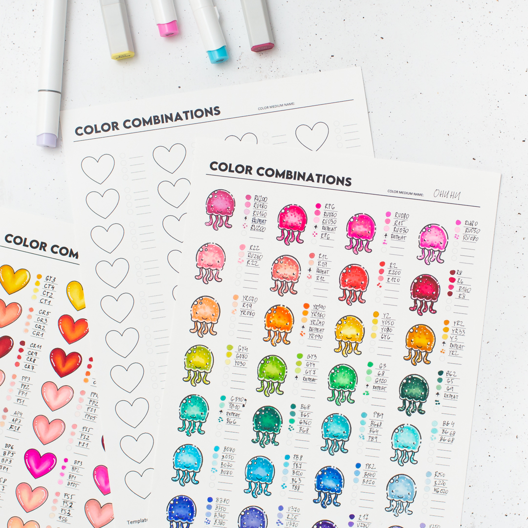
Many times during the cardmaking process I find a new (to me) super cool color combo that I like, and because of the lack of time, I just mark it somewhere to a piece of cardstock. Next time, when I need it again of course I can’t find it and I am going with the same used color. Can you relate? 😅
Anyway, this is the reason why I made this color combo chart. To have it close to my desk, and when I need it, I am swatching the markers to those teeny-tiny circles to have marked done and when I have more time, I finish it with a little sample coloring to see how it looks, when those colors are used together. This really works for me and I thought you might find it useful as well.
Color Combinations
I thought it might be inspirational for you to see my color combos, and maybe you can save a few to your swatchbook. I will add more soon to this post, feel free to bookmark it and come back later. :)
Better craft photos are easier than you think. Start with 5 simple tips you can try today. 🎁Get my free photo ebook here!
On the Image above I have swatched my Ohuhu markers. Use this Ohuhu discount code to get 10% off your Ohuhu order: LXZ-JJD21Q6
I have the 219 set from the Honolulu Series, so I am pretty sure I will make more swatches in the future, I just need to find a bit of time for it. I have printed the Small Spacing Chart, because the So Jelly stamp set is smaller and a good fit. I have used the Jet Black Inkpad for stamping.
Click on the image if you want to enlarge it
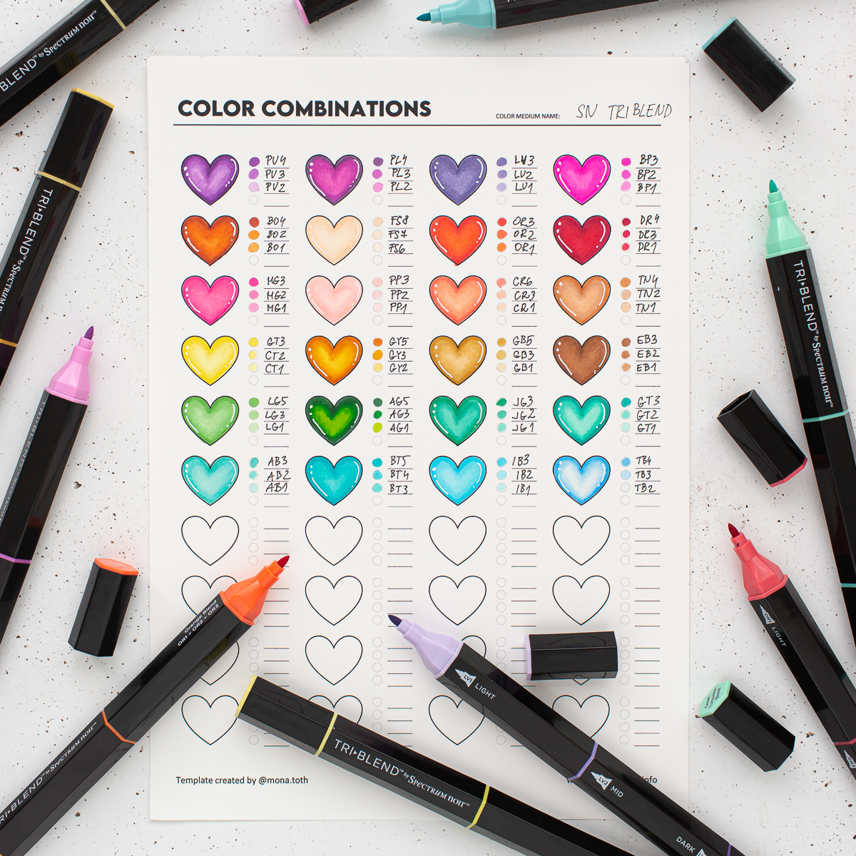
I have a few Spectrum Noir Triblend Markers, so I swatched them quickly as well. I printed the heart shaped aka “pre stamped” swatch chart, so I saves a lot of time with the stamping.
Click on the image if you want to enlarge it
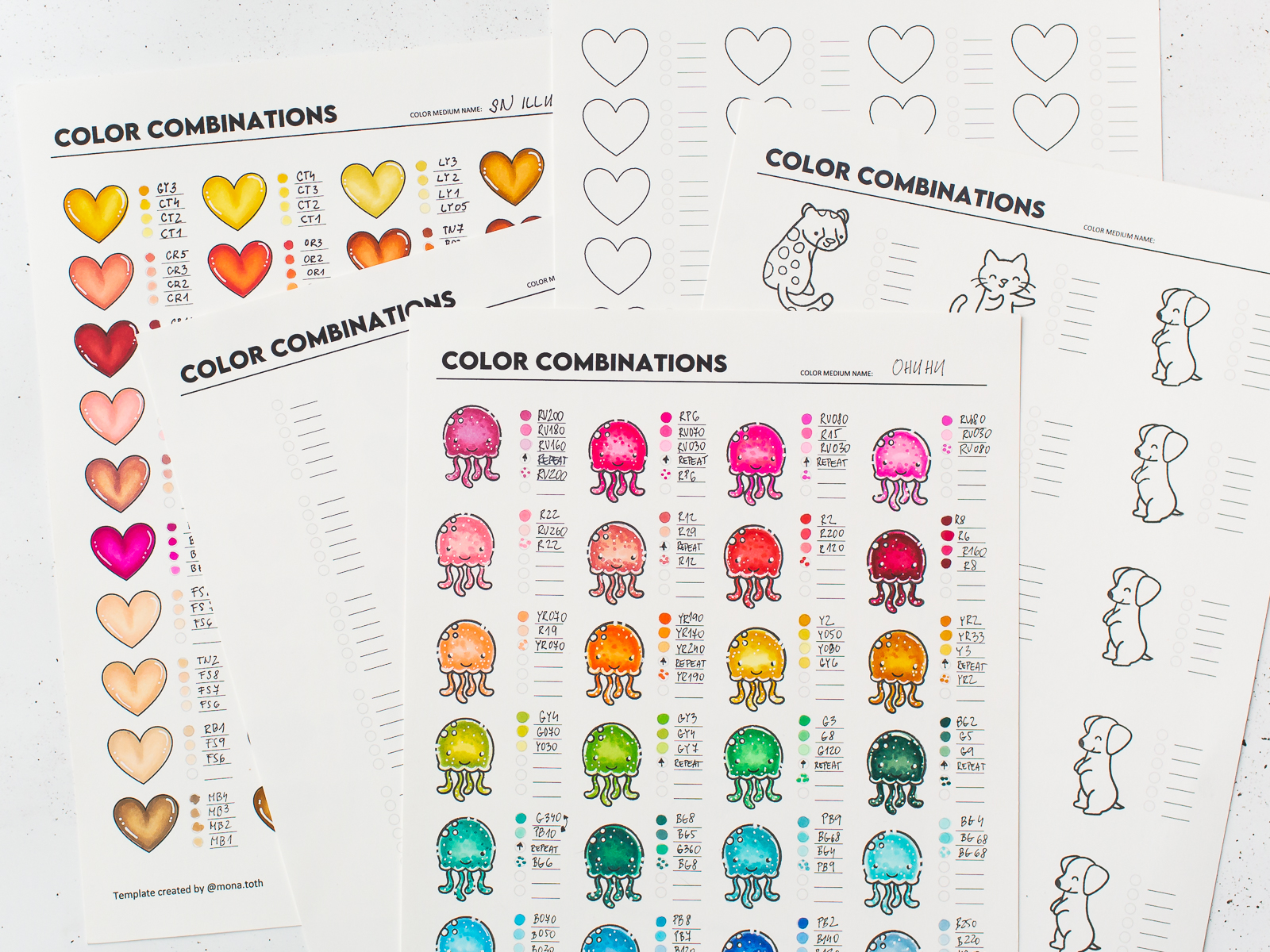
Here I did the same process, but this time for Spectrum Noir Illustrators. This is just a warms sheet, probably I will make a cool version as well in the near future.
More information and tips with the swatch cards
There are two sizes, A4 International and US Letter, so you can print the version which you prefer more.
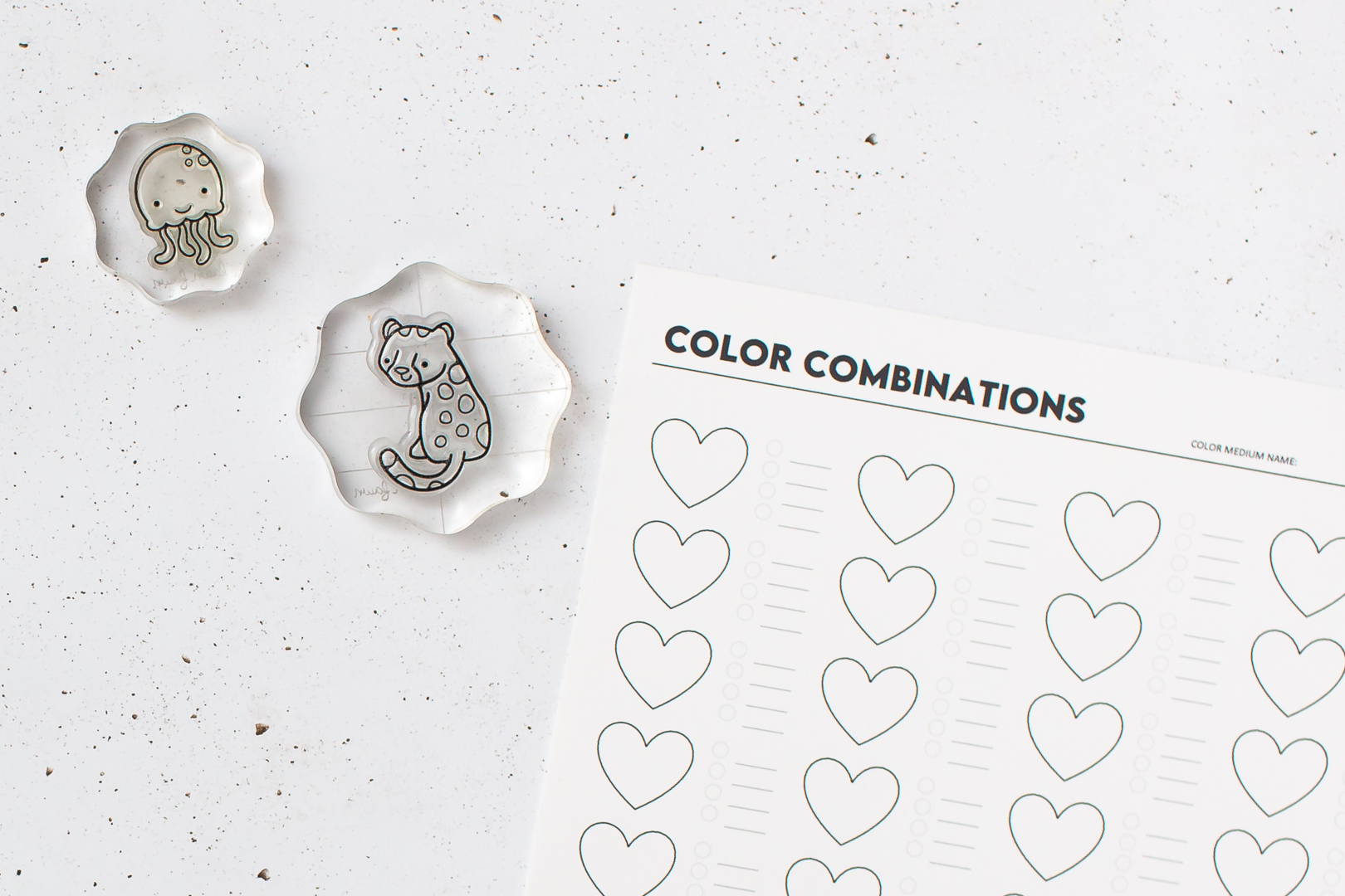
As I already wrote, there are two types of the printables. One heart shaped aka “pre stamped” so it’s ready to use and two empty ones for stamping with the wished stamp set. One version is for the smaller stamp sets like the So Jelly mini set I have used for color swatching, and one for bigger images like these super sweet Lawn Fawn critters.
If you want to swatch your alcohol markers, like Copics, Ohuhu, Spectrum Noir or others, then I suggest you to print the PDF with inkjet printer to a Neenah Solar White Cardstock or any alcohol marker friendly cardstock you prefer.
If you want to swatch your water-based markers and color mediums like Tombow Markers, Karin Markers or Watercolors, then print the PDF with laser printer, to your favorite watercolor paper.
If you print the empty one, I suggest you to check which size is the better for your wished stamp set. (Yes, the L size was born because I started the stamping with a bit bigger stamp. 😅) I suggest you the Jet Black inkpad for stamping by Lawn Fawn, and before coloring make sure to give a heat set with heat gun to the entire surface before you start the coloring process. This will prevent the ink smearing from the outlines.
You can use it for color combo swatching but you can create your own combos by the type of critters as well. For example, cats or dogs in different colors and many others as well. It can speeds up your coloring process in the future and you can find new favorite combos as well.
If you are in a rush, just color the small dots on the cardstock and you will finish the sample coloring later you have time.
You can also find some coloring guides on my Instagram too.
Freebie
If you like these printables then I have good news for you!It’s a freebie for my newsletter subscribers.
If you want to get the updated color combo chart, check out my free downloads page, and search for the image: Turn Your Color Ideas Into Organized Magic here. I have updated these charts in 2025 November, so you they are better than ever, and you will find many more fun printables inside for your color swatches. 😻
BEFORE YOU GO...
Let’s stay crafty friends! You can find more cardmaking inspiration, behind-the-scenes peeks and photography tips for crafters on my Instagram and Facebook pages.
📷✨ I’m on a mission to help cardmakers and crafters feel more confident with photography, so their beautiful creations can shine online too.
I’ve listed all the supplies I used below, so you can easily find them. Some of the links are affiliate links, which means I may earn a small commission if you make a purchase, at no extra cost to you. Thank you so much for supporting my blog and creative work!
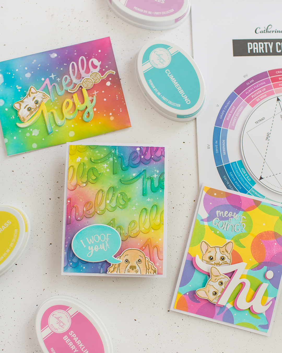
Hi crafty friend! It’s been a while since I posted on my blog, so with a big smile on my face I am bringing you some rainbow cards with some of my favorite techniques on how to use a word die.
Better craft photos are easier than you think. Start with 5 simple tips you can try today. 🎁Get my free photo ebook here!
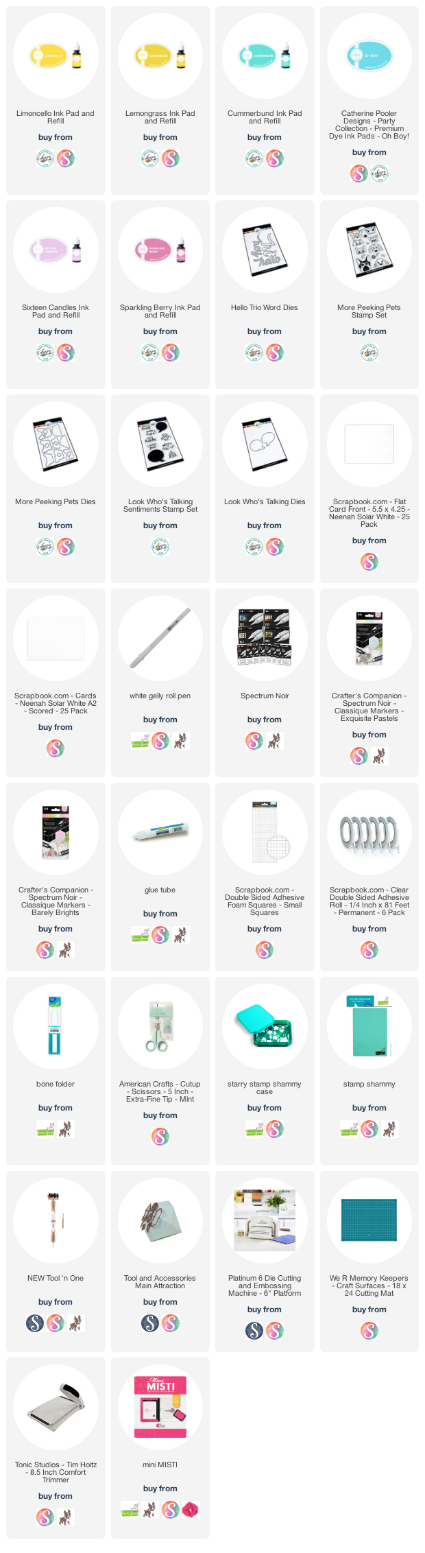
For the additional supplies with shop links visit the thumbnails below this post.
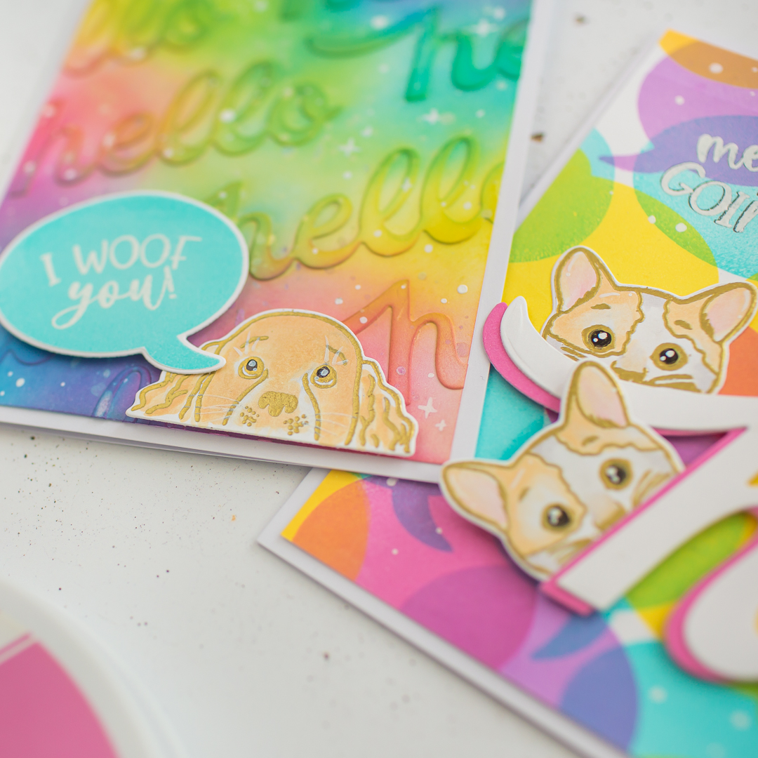
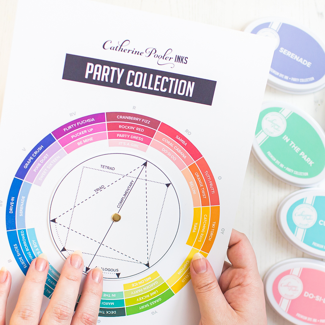
Before we are jumping to the techniques, I just want to tell that, for all the three cards I heat embossed the cute pet images from the More Peeking Pets Stamp Set with gold embossing powder, then I made on them a very basic and soft coloring, because I knew I want to rock the colors on the backgrounds! The free color wheel I have mentioned before in this postwas very useful to mix up the colors.
For the fist card I have created an easy rainbow inkblending to the background with 3 ink colors called: Oh Boy!, Lemongrass and Sparkling Berry Catherine Pooler Inks (links below the post). I have used the same inkpads on the The Hello Trio Word Dies Diecuts as well but way more gently. With the Hey word die I have created loads of die-cuts to add to my card a bit dimension.
For my second card which is my absolute favorite from this set, I created lots of “hello” diecuts with the same The Hello Trio Word Dies and I adhered them diagonally to a piece of a heavyweight cardstock and started the blending over it. Because the word is a bit higher the blending gives such a nice 3D effect! Finally, a lovely turquoise speech bubble with a cute dog was enough to finish this design.
For the third card I created a rainbow with stamping. I just picked the Speech bubble solid stamp from the Look Who's Talking Stamp Set and stamped with different colors (listed below) to achieve this fun rainbow look. In the end I just layered the Hi word diecut and adhered it with 3D foam squares to its right place. Thank you so much for stopping by, I hope you have enjoyed this quick post, let me know in your comment which one do you like more.
If you love to watch ink swatching, or swatch ideas are useful and handy for you, I would suggest you to watch my latest video tutorial with the mentioned inkpads in this post here or below.
BEFORE YOU GO...
Let’s stay crafty friends! You can find more cardmaking inspiration, behind-the-scenes peeks and photography tips for crafters on my Instagram and Facebook pages.
📷✨ I’m on a mission to help cardmakers and crafters feel more confident with photography, so their beautiful creations can shine online too.
I’ve listed all the supplies I used below, so you can easily find them. Some of the links are affiliate links, which means I may earn a small commission if you make a purchase, at no extra cost to you. Thank you so much for supporting my blog and creative work!
I was planning to write this post since forever, when I had an opportunity to try the Catherine Pooler Ink Pads according to the Winter Trio Hop which was a really great hop between three amazing brands, but I wanted to test them longer.
I am not going to lie, I never understood the hype around these ink pads, but when I received them in November, I fell in love with them, and I needed to order some colors immediately! I can tell you, I was the happiest girl ever when they sent me the new Ink Pads! Why? Read the details below.
Better craft photos are easier than you think. Start with 5 simple tips you can try today. 🎁Get my free photo ebook here!
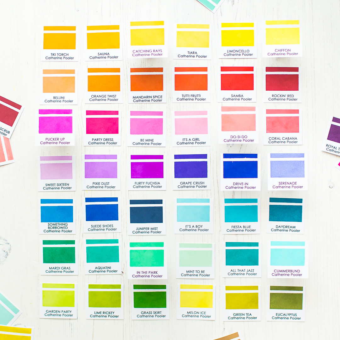
Now Catherine Pooler INKS have their FREE own swatch printable, what I will use in the future too because it's very cute and useful (you can find it here). But when I created this post, for the swatching I have used the editable ink swatch template from Jennifer McGuire, edited with the names of inkpads then printed out to heavy weight cardstock. In the end I swatched my inkpads with the Color Swatches for Ink Pads Stamp set. Now let’s jump to the mentioned tips.
PERFECT FOR STAMPING
Okay, everybody knows that, the inkpads are for stamping, so why I am wasting your time here with this tip? Of course, the inkpads are for stamping, but I want to mention, that these inkpads have really high quality, smooth foam pads and they are super juicy.
You barely have to touch the inkpads with your stamps which means, one or maximally two taps with Catherine Pooler Ink Pads are enough to cover your image perfectly and you are ready to stamp. It transfers perfectly and the result is a beautifully smooth finish.
You don’t need to repeat the stamping process for the same image, because the stamping result will be solid and smooth from one stamping which is priceless and time saving as well.
I am in love with the beautiful Cummerbund color I have used on this card. For me this is the perfect light turquoise color, and I can’t get enough of it! For more details of this card visit my Instagram post here.
USE THEM AS WATERCOLORS
The Catherine Pooler Ink Pads are a perfect choice for your favorite water coloring techniques like various watercolor washes as well as wet-on-wet or wet-on-dry techniques. I am planning to order in the future their re-inkers and use them as watercolors too.
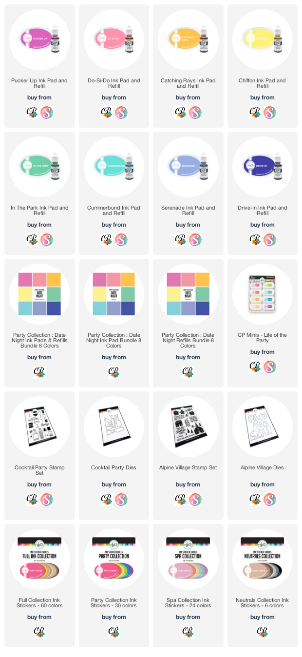
I have created this simple and easy card with the new Date Night Ink Pad Collection where I have used them as watercolors. In the background you can see watercolor stripes from three shades only.
I have used Cummerbund, Pucker Up and Chiffon colors. I painted with Cummerbund first and after a quick heat set continued with the other colors too.
I just overlapped the colors and the result is this bright rainbow striped background.
THEY ARE GOOD FOR STAMP LAYERING
If you check the full inkpad collection, you will notice that, the colors are coordinated perfectly. You will find many inkpads in matching tones and saturations. After the stamping you will need to wait a few seconds until it dries. The totally dried image will be as light as the lid, but I will talk about this later in this post.
IT’S A COLORFUL WATERMAKR INK
If you have clear embossing powder in your stash, then I suggest you to try your Catherine Pooler Ink Pads as a colorful watermark ink.
These inkpads do not dry immediately, so you will have a few seconds to add embossing powder to the top of it. Then just continue your heat embossing process. It’s so cool especially for the sentiments! 💙
YOU CAN USE THEM FOR INKBLENDING
When the background was dry on my previous card, I made an ink blending with the Catching Rays Ink Pad behind the sentiment, to pop it out more.
So YASSS! The Catherine Pooler Ink Pads are perfect for smooth ink blending too and it looks really nice, when you are combining two techniques on one card.
OTHER FANCY TECHNIQUES
Beside the above-mentioned techniques, you can use these inkpads for many trendy cardmaking techniques like the Stamp Kissing, Ink splattering, distressing with water and many more. You can mix the colors with white watercolor to make it more pastel for water coloring, or mix it with white gouache to have opaque colorful splatter in any color.
This is another example above. Here I have created the background with Flirty Fuchsia and Aquatini from the Life of The Party Mini Set. (For the houses I have used the same set.) Then splattered with various watercolor mixes. The result is a bright and smooth blend with cool splatters. Read more about this winter card here.
THERE ARE NO MORE COLOR TRANSFER PROBLEMS
The stampers biggest nightmare is to stamp after a vibrant dark color a lighter one to get the wanted light shade. Or drop the acrylic block to the finished stamping LOL Unfortunately the Catherine Pooler Ink Pads will not levitate your stamping blocks, but you can feel totally safe, stamping a lighter color after a vibrant ink color.
Just make sure to clean your stamp before the next color. I am cleaning mine with stamp shammy, then I am stamping a few times on a scratch paper before inking it again.
FREE COLOR WHEEL
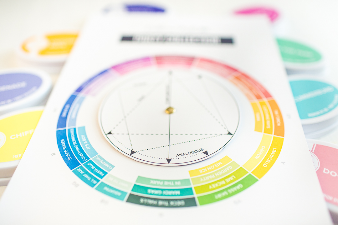
I was super excited when I saw, that they created a new Color Wheel for their inkpads, which you can download FOR FREE! Version 1 | Updated version 2 with the new ink colors.
I always wanted to have a color wheel and now I have more, because it totally coordinates with the inkpads I love, and I don’t need to think about what colors to choose. Be sure to follow their blogpost to learn how useful it is for creating your own color combos. And they have a color theory to the post with video tutorial too.
IT HAS WIDE RANGE OF COLORS
They separate their inkpads in two categories, by the colors. In the Party Collection you will find fully saturated colors, which means they are happy, bright and vibrant colors. In the shop you can see them in rainbow order which is really inspirational.
In the Spa Collection you will find low saturated, soothing colors, kind of muted and greyed down colors which are really trendy now and, on the cards, they just look amazing.
INNOVATIVE DESIGN
Last but not the least, let me talk about their inkpad design. First of all, I really love that they are white, and on the top of the lids you can see the inkpad color. In 2021 Catherine Pooler Designs Updated their Ink Pad Labels. They did this because they wanted to have a more accurate representation of their ink colors.
This means, that the top of the inkpad, will match with your stamped image once it has dried. Soo fantastic right? They made it available for their existing customers for an affordable price, if they want to fresh up their already owned inkpad lids. If you don’t own Catherine Pooler Ink Pads yet, then you will receive automatically the upgraded inkpad lid.
VIDEO TUTORIAL
** Update 1/9/22: I have swatched all my Catherine Pooler Inkpads with some really useful stuff what they released in a video tutorial. Watch the video here or below.
Thank you so much for joining me today, I hope you found this post useful. I really like the Catherine Pooler Ink Pads, they are amazing! Please let me know in your comment what are you thinking about this brand. If you want to read more about their ink pads, feel free to check their All About Inks post. See you next time, Mona.
BEFORE YOU GO...
Let’s stay crafty friends! You can find more cardmaking inspiration, behind-the-scenes peeks and photography tips for crafters on my Instagram and Facebook pages.
📷✨ I’m on a mission to help cardmakers and crafters feel more confident with photography, so their beautiful creations can shine online too.
I’ve listed all the supplies I used below, so you can easily find them. Some of the links are affiliate links, which means I may earn a small commission if you make a purchase, at no extra cost to you. Thank you so much for supporting my blog and creative work!