Featured

Summer Floral Card Tutorial: The Ink Blending Trick That Makes Colors Pop

Today I’m creating two colorful floral cards featuring the Peony Corners Bundle from the newest Alex Syberia Designs release.

This video is also part of the YouTube Hop + Giveaway, with some fun prizes to win!


You can watch the full cardmaking tutorial above and find the supplies linked throughout the post.

For these handmade cards, I’m combining the Peony Corners Bundle with ink blending, layered die cuts, and dimensional details. And as you’ll see in the video, one little ink blending mistake actually changes the direction of the card.

STAMPING THE PEONY CORNERS

I started with the Peony Corners Bundle, stamping the large floral image with my MISTI.

With larger stamps like this, I usually stamp the image at least twice to get a nice, crisp impression. I also give the ink a quick heat-set before moving on to the stenciling.

Better craft photos are easier than you think. Start with 5 simple tips you can try today.
🎁 Get my free photo ebook here!

INK BELNDING THE FLOWERS

For the orange flowers, I stared with Catching Rays Catherine Pooler Ink, followed by the slightly darker Tiki Torch. For the final shade, I bring in Coral Cabana. Although all three colors belong to a similar palette, Coral Cabana is cooler compared with the first two warmer orange shades.


Using both warm and cool versions of a color creates a subtle contrast that helps the analogous color combination pop.

For the blue flowers, I use Cummerbund as the warmer shade and Serenade as the cooler shade. This is also where things don’t quite go according to plan. I accidentally blend some orange into the blue and use a brush that is too large for the area.


Instead of starting over, I keep working with it, and I actually end up liking the finished flowers even more than my original idea. I corrected my mistake with Ohuhu Nahuku Acrylic Markers. Watch the video above how I did it.

ADDING COLOR TO THE LEAVES

For the leaves, I keep the palette warm without adding the cooler color contrast. I blend Lemongrass as the lighter shade and Green Tea as the darker shade. At the end, I return to Catching Rays to touch up the flower centers before die-cutting the finished floral images.


CREATING THE DIE-CUT BACKGROUND

For the background, I die-cut a frame using the Whimsical Scalloped Frames. I take the white cardstock left over from the center and run it through my die-cut machine again using the Charming Flora Cover Die. I also create one full die-cut with the same cover die. These pieces create the layered white background behind the colorful florals.


ADDING THE SENTIMENT

For the sentiment, I use the Thanks and Hugs Die Set. I die-cut the sentiment from Altenew Dazzling Diamond Cardstock and vellum, then adhere the layers together with liquid adhesive.

The scalloped frame is attached to the card front with foam adhesive, followed by the floral die cuts with smaller foam squares. Finally, I add a few clear sequins.

Pin this post to your Pinterest board and save this card idea for later.

PHOTO TIP FOR CARDMAKERS 

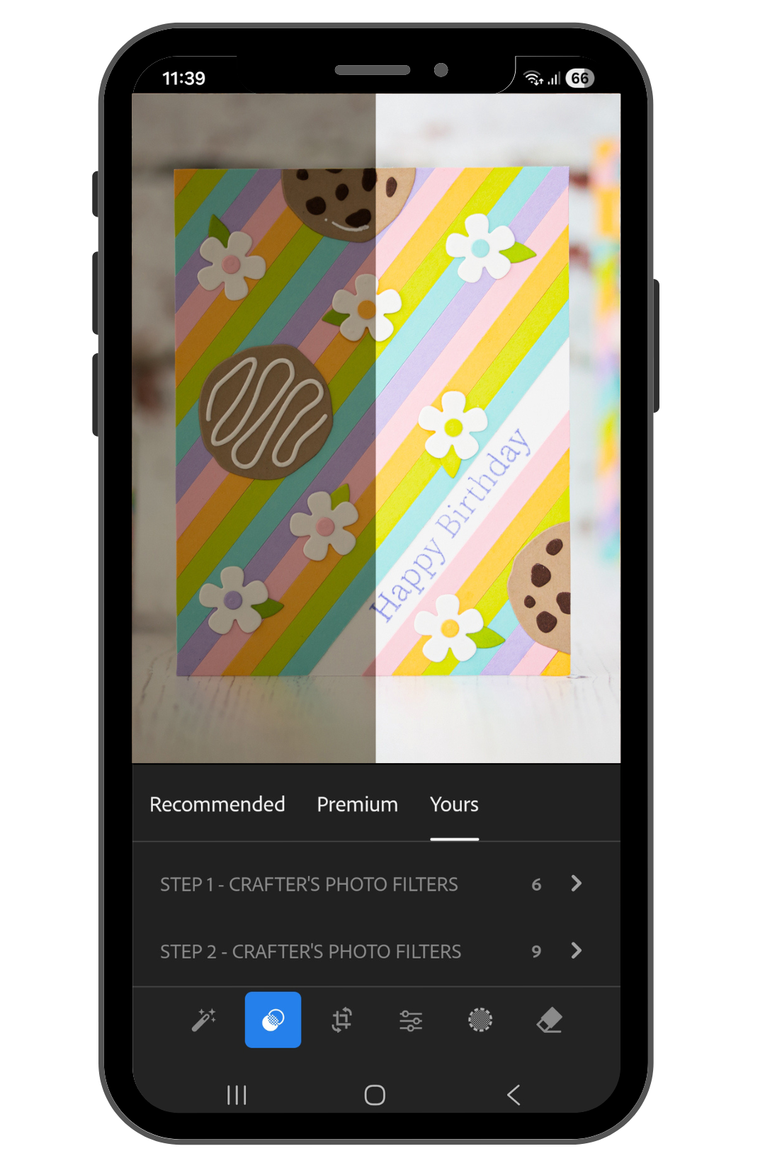
One little reminder for fellow cardmakers who photograph their projects: my photos don’t look finished straight out of the camera either. Let me show you what I mean. This is what they look like when I’m done with the photoshoot, before editing:


I edit these images, just like my other cardmaking photos, using my editing shortcut, Crafter’s Photo Filters. They’re made especially for us cardmakers to help our card photos pop quickly and save time on editing. For more information, visit the Crafter’s Photo Filters page.

BEFORE YOU GO...

Let’s stay crafty friends! You can find more cardmaking inspiration, behind-the-scenes peeks and photography tips for crafters on my Instagram and Facebook pages. 

📸✨ I’m on a mission to help cardmakers and crafters feel more confident with photography, so their beautiful creations can shine online too.

USED SUPPLIES

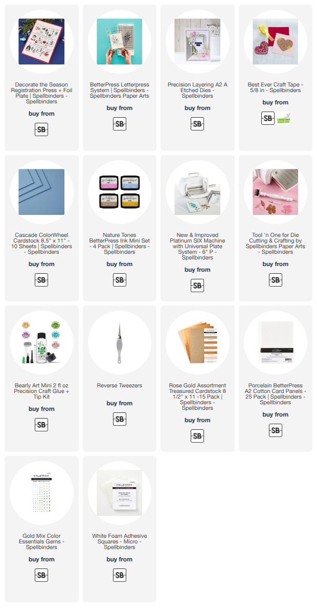
I’ve listed all the supplies I used below, so you can easily find them. Some of the links are affiliate links, which means I may earn a small commission if you make a purchase, at no extra cost to you. Thank you so much for supporting my blog and creative work!

Alex Syberia Designs August Release - Happy Cuties and Peony Corners - Giveaway

Hello crafty friend! Welcome to the Happy Cuties and Peony Corners August Release Blog Hop by Alex Syberia Designs ! Leave a comment on the blogs posts on the hop for a chance to win! Beside the lovely inspirations we have a pretty nice giveaway too! You can find the details about it in this post!


THIS CARD FEATURES


Better craft photos are easier than you think. Start with 5 simple tips you can try today.
🎁 Get my free photo ebook here!

STAMPING AND STENCILING

I started this card with the beautiful Peony Corners Stamp Set. I picked the corner image and stamped it twice with Lawn Fawn Jet Black Ink using my MISTI stamping platform. Once the images were stamped, I heat set them with my heat gun before moving on to the coloring.


For the coloring I used the coordinating Peony Corners Stencil Set. I started with the flower centers using Squeezed Lemonade and added a little Fossilized Amber Distress Oxide Ink here and there. Then I blended Kitsch Flamingo around the petals, going slightly over the yellow areas too. This little overlap created that pretty peachy color which I really love.


Pin this post to your Pinterest board and save this card idea for later.

For the second layer, I turned the stencil and added Picked Raspberry to the larger flowers and Spun Sugar Distress Oxide Ink to the smaller ones.

Next I moved on to the leaves and flower centers with the other stencil. For these areas I used Black Soot, Hickory Smoke and Old Paper Distress Oxide Inks, then finished the flower centers with Black Soot as well.


STAMPING AND DIE CUTTING

Once all the ink blending was finished, I placed the cardstock back into my MISTI. I had kept the stamp in exactly the same position, so I could stamp the images once again with VersaFine Onyx Black Ink. This brought back the crisp outlines beautifully after all the ink blending.

After heat setting the ink, I used the coordinating Peony Corners Die Set and ran both images through my Platinum SIX Die Cutting Machine.


HOT FOILED SENTIMENT

For the sentiment I used the Essential Sentiments Press Plate & Die Set. I really love this set because with just one foiling and one die-cutting step, you can create a whole bunch of beautiful sentiments at once. Such a time saver!

I used the satin gold foil from the Satin Metallics Variety Pack, then die cut all the sentiments so I could choose the one that worked best with my card.


PUTTING THE CARD TOGETHER

For the card base, I paired a warm yellowish olive cardstock with a brighter pink cardstock. I really love how these colors work with the peachy pink flowers. They already give me a tiny bit of an autumn feeling, and you know how much I love that season!

I adhered the Peony Corners with 3D foam squares to give the card some dimension. Then I added the hot foiled sentiment on top, raising it a little higher so it would stand out nicely between the flowers.


Finally, I added a few clear sequins for a little extra sparkle, and the card was finished. I absolutely love how these colors turned out together! And you will see this beautiful Peony Corners set from me again very soon, because I also have a YouTube video tutorial coming with it. So keep an eye on my Instagram for the sneak peek! 👀✨

If you are new here, you can also find me on Instagram as @mona.toth where I share photo tips for crafters, and more cardmaking inspirations. (Yes, I have a facebook page too) :) 

GIVEAWAY

Alex Syberia Designs is giving away a $15 or £15 gift card to three lucky winners.

The giveaway is open internationally. All three winners will be selected from entrants who take part in the blog hop by 11:59 pm BST on August 16 2026. The winners will be announced on the 'Giveaway Winners' page of the Alex Syberia Designs blog on 17 August 2026.

BLOG HOP ORDER


BEFORE YOU GO...

Let’s stay crafty friends! You can find more cardmaking inspiration, behind-the-scenes peeks and photography tips for crafters on my Instagram and Facebook pages. 

📸✨ I’m on a mission to help cardmakers and crafters feel more confident with photography, so their beautiful creations can shine online too.

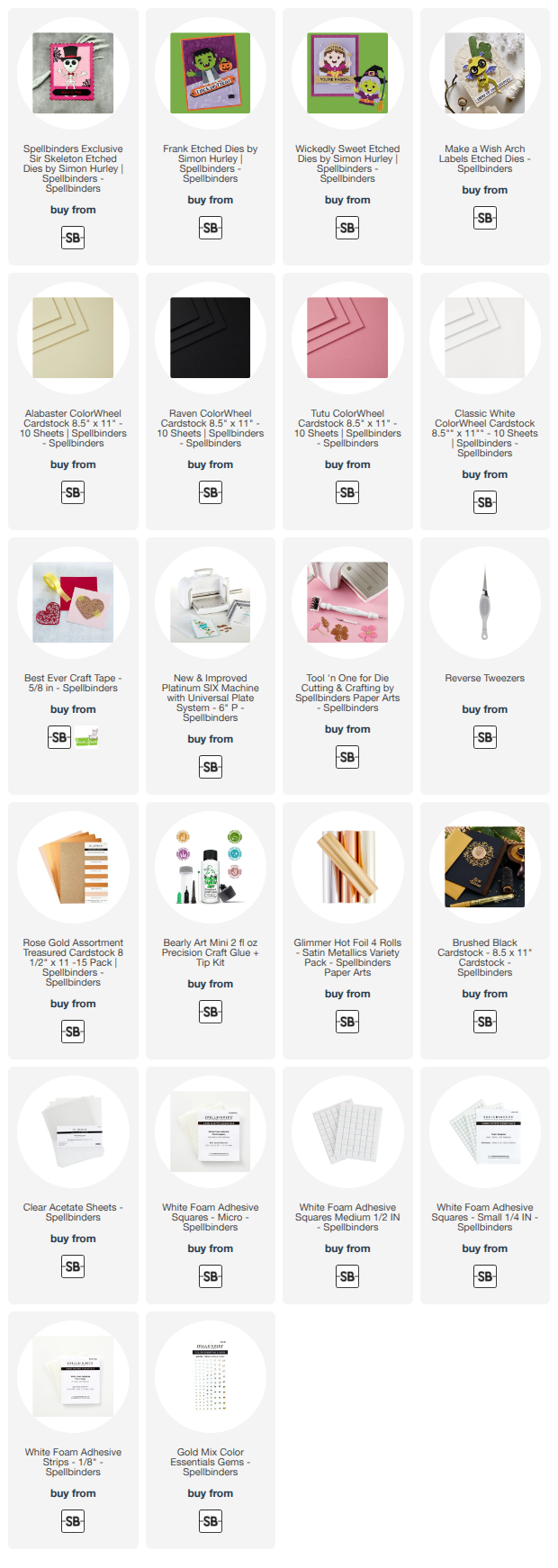
USED SUPPLIES

I’ve listed all the supplies I used below, so you can easily find them. Some of the links are affiliate links, which means I may earn a small commission if you make a purchase, at no extra cost to you. Thank you so much for supporting my blog and creative work!

Polar Bear Christmas Card Tutorial with Alcohol Markers - Spellbinders

Hi cardmaking friends, today I am guesting over on the Spellbinders Blog with an easy to follow step-by-step tutorial featuring the Polar Friends Stamp and Die Set by Simon Hurley. Here is a peek of the card.

Better craft photos are easier than you think. Start with 5 simple tips you can try today.
🎁 Get my free photo ebook here!

In this tutorial, I’ll show you how to color this adorable polar bear with alcohol markers, and turn it into a bright Christmas card with an arched window. This is just a sneak peek, so please check the original post with the easy to follow step-by-step tutorial on the Spellbinders blog.

Pin this post to your Pinterest board and save this card idea for later.

BEFORE YOU GO...

Let’s stay crafty friends! You can find more cardmaking inspiration, behind-the-scenes peeks and photography tips for crafters on my Instagram and Facebook pages. 

📸✨ I’m on a mission to help cardmakers and crafters feel more confident with photography, so their beautiful creations can shine online too.

USED SUPPLIES

I’ve listed all the supplies I used below, so you can easily find them. Some of the links are affiliate links, which means I may earn a small commission if you make a purchase, at no extra cost to you. Thank you so much for supporting my blog and creative work!